New Brand Puredyne Wins Design Award

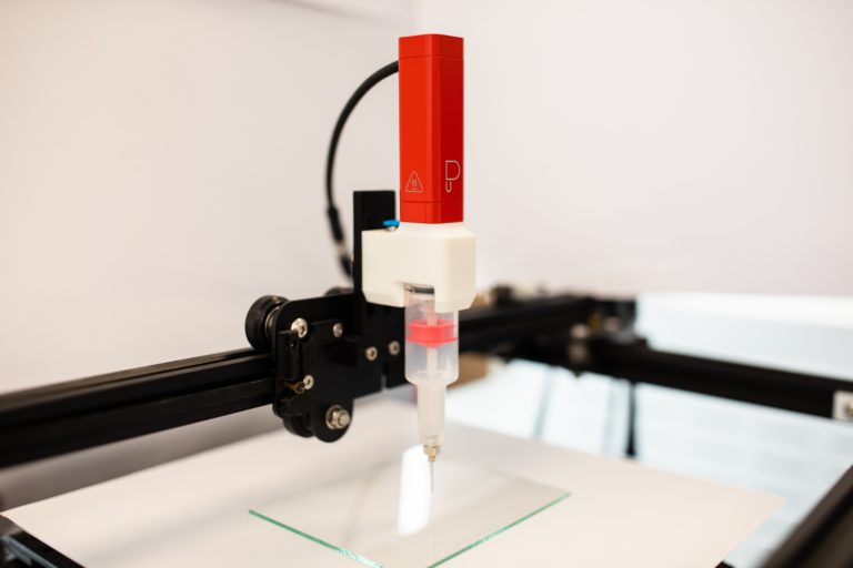
Winner of the Red Dot Design Award: Puredyne printhead. (Image source: ViscoTec Pumpen- u. Dosiertechnik GmbH)
Based on the fact that in the industrial environment, functionality is very often the biggest driving force, while appearance is overlooked, the engineers at Puredyne pursued a new path: For the first time, print heads for extrusion-based bioprinting were to be designed in such a way that design and functionality form a symbiosis. Until now, users of pneumatic extrusion were confronted with a lack of suck-back mechanisms and inaccurate control. This was the starting point for the development of the Puredyne brand; with the aim of being able to achieve highly precise printing results. The target group of Puredyne are not only companies with a focus on plant engineering in bioprinting, but also on teaching and on research. Customers from this environment are usually looking for an intuitive application that allows them to work easily and cleanly on a small scale, while at the same time being able to rely on the same process control as large, automated lines.
The engineers therefore focused on the user, who should at best not only be aware of the technical advantages mentioned, but also see and feel them. The design was to be minimalist, based on the Bauhaus style. The developers at Puredyne wanted to make this visible through strong yet harmonious elements, clear lines, a minimalist design, and bright primary colors. As a result, ViscoTec launched a print head in dominant red with its new Puredyne brand, which clearly differentiates itself visually from the parent brand. The white adapter with transparent stator picks up on the ViscoTec design without competing with it – a sign that the strong parent brand is completely fulfilling its function.


